OOF Magazine | ummm not actually us but...
Read MoreTHE AGE: DOMAIN | MELBOURNE'S BEST DESIGNED SUBURB
Hello House now a local icon?
Read MoreARCHITETTE-ARCHIWOMEN DIRECTORY
Architette Women Architects Directory
Read MoreDESIGNMILK | BEST ARCHITECTURE POSTS OF 2017
Acute House on Design Milk's best archi posts for 2017
Read MoreBraga Stadium by Eduardo Souto De Moura | photo: Fooi-Ling Khoo
DoCoMoMo International Conference 2016
The largest + most important gathering of Modernism nerds anywhere in the world
Read MoreIllustration | Oslo Davis
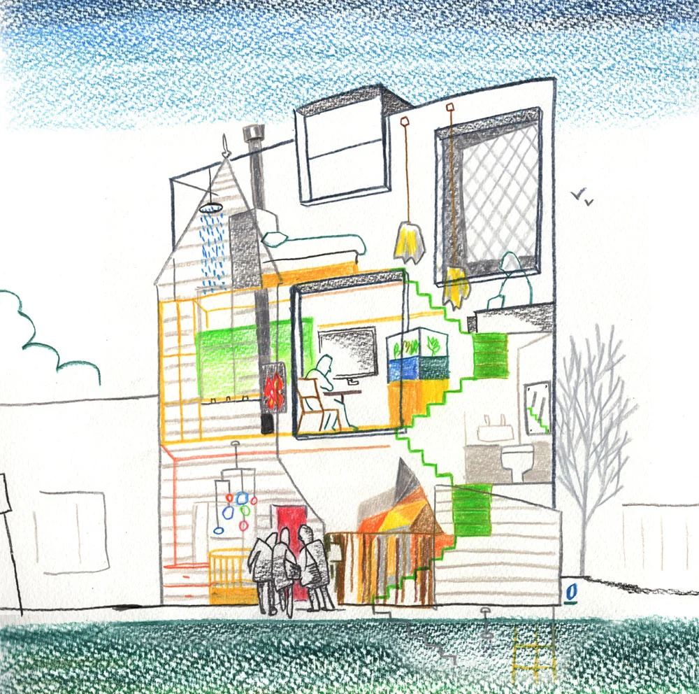
ACUTE HOUSE | Just got cuter thanks to #OsloDavis
ACUTE HOUSE | Just got cuter thanks to #OsloDavis
Read MoreHouses that Engage with the Street | The Weekly Review
Houses that Engage with the Street | Weekly Review
Read MoreACUTE HOUSE | HERALD SUN
Acute House | Front Cover of the Herald Sun
Read MorePhoto courtesy of Fisher & Paykel
FISHER & PAYKEL | GLOBAL BRAND?
by Fooi-Ling Khoo | April 15, 2016 | Published in Datum | ArchiTeam Newsletter | 15 April 2016
ArchiTeam, along with a lucky little group of Melbourne architects, was flown to Sydney for the opening night celebrations of the new Fisher & Paykel “Experience Centre” in Alexandria. Upon arrival in Sydney, there was just enough time before the opening to inspect our hotel, Tonkin Zulaika Greer’s charmingly revamped Old Clare Hotel in Chippendale; raid the local Daiso for snacks; and inspect the nearby Starchitecture of Jean Nouvel’s hanging gardens and heliostats.
That evening, a waiting minibus bundled us off to the opening night event at the Experience Centre. It was a fun and chatty evening of just enough speeches and plenty of mingling with a diverse range of architects from one-man-bands to plush firms producing luxury apartments, proprietors of mega appliance outlets and, of course, Fisher & Paykel reps.
All around us, Fisher & Paykel’s showroom ovens slaved courageously in the service of our delicious snacks. We enjoyed the tasty aromas as much as the treats themselves, showing once again, why everyone ends up in the kitchen at parties.
While offered in a relaxed and generous spirit, this level of largesse is unusual in the architectural world and clearly, something was afoot in this showroom. Instead of the typical fluro lit barn of rack upon rack of product, the emphasis here is on a more “residential” experience. A luxurious residence of course and without the selling pressures expected in a retail environment.
Well-known New Zealand architects, Fearon Hay, were commissioned to design a showroom replete with the hallmarks of tasteful contemporary homes - polished timber floorboards, warm downlights, stainless steel and stone benches. No laminate in sight. The intention here is to shift perceptions. Where you might have expected to see Smeg or Miele, you will see Fisher & Paykel.
Since Fisher & Paykel’s acquisition in 2012 by the Haier Group, the Chinese appliance giant, it is now an international company operating in 50 countries and manufacturing globally as well as in its native NZ. This international expansion is not so well known to the Australian market who, probably, still regard them as local. Fisher & Paykel’s intention – and the showroom is part of this campaign – is to elevate their brand from the sensible and upper middle brackets in Australia into the prestige niche currently occupied by global European brands such as Miele, Smeg, Bosch, Asko et al.
“Fisher & Paykel’s goal is to be the number one premium appliance brand globally, and in order to do so, we must be synonymous with the kitchen. The concept of the Experience Centre was born out of an intimate understanding of our customers and their various lifestyle needs. We have a desire to inspire,” said Mark Elmore, General Manager Design Integration at Fisher & Paykel.
Australia’s first Fisher & Paykel Experience Centre is located at 90-96 Bourke Street, Alexandria. Visit www.fisherpaykel.com/au/experience/experience-centres-sydney/ to learn more, or contact ausdesign@fisherpaykel.com to register interest in a tailored experience for your clients with product design experts, or to book a time in the centre for a meetings with customers.
Fisher & Paykel is a proud sponsor of the ArchiTeam Awards
Back to WRITING
Photo Courtesy of The Age
SAM, PAM, THANK YOU MA'AM | THE NEWMAN HOUSE
by David Brand | Published in The Age | 4 Aug 2000
[a local councillor of the City of Port Phillip, responds to reports by Jo-Anne Roberts & Norman Day in The Age]
The wraps are off. And, yes, Sam Newman's house is one large blurry portrait of Baywatch star Pamela Anderson. It's rather pretty, in her snow storm of misty-blue pixilation. But that's Pamela Anderson. In terms of architecture, public art, planning policy and self-promotion rights, "pretty" is just the shallow end of the issue. The Sammy and Pammy story has touched a nerve that has blown up a storm of media commentary and dinner party speculation across the whole of Melbourne and beyond.
The recipe is ripe: a double celebrity billing, a stern local council, and a frenzy of commentators, professional and amateur, on the arts, architecture and the fundamentals of civil liberty. As with all good controversial trivia, no-one can help having a clear-cut opinion, no matter how ill-researched or off-the-cuff. One person's "rather pretty" is another one's poison.
The blurriness of the pixilated image underscores the blurriness of the issues it raises. Art, architecture and advertising blend in a soup created by its designer, Cassandra Fahey, and flavoured cause celebre.
Almost predictably though, the one really clear-cut facet of the story has been the main focus of all the fuss over recent weeks - the enforcement proceedings against the erected image being taken by the City of Port Phillip. Interested parties have waxed purple about our city planners' "conservative" stance of disapproval. One simple fact seems to have escaped almost every media commentator: the council cannot approve of a proposal until an application for it has been submitted. The current approved permit drawings show a plain-patterned façade - no Pamela, no portrait. Simply, the built image was not approved because there was no application for it. Therefore the image must be taken down, or, in the meantime, a fresh planning application made for it.
Whether or not the image contravenes any aspect of Port Phillip's planning scheme has not been tested. So far it has only failed to conform to the permit drawings submitted by the applicant. The City of Port Phillip has passed judgement on neither the planning nor aesthetic merits of the Big Pam - the opportunity simply hasn't yet arisen. Councillors are looking forward to the debate (if it comes) with a sense of intrigue, and perhaps some trepidation. The issues at stake are surprisingly ambiguous and complex.
How does a planning scheme balance the right of a property owner to build what he likes with the right of his neighbours not to be affronted by it? How does an individual building fit a wider urban character or heritage context? Which grounds for public objection can a claim to public art override? In the end, can architecture, urban art and promotional advertising be distinguished from one another? (The City of Port Phillip currently has three very distinct policies for these in place!)
Most architecture, and all "public" art, is distinguished from private art by one key factor: it has a captive audience, the public, to which it owes some responsibility. If Mr Newman were to simply reverse his house façade to face inwards, making it a purely private affair, there would be no issue. As it stands now, it is the public, and especially the neighbours opposite, of whom the effort of art appreciation is required. Maybe we'll all love it, but the public interest, through Council's planning processes, at least needs to be addressed.
Public art, of course, cannot be judged by popularity poll. It's at its best when it is challenging, provocative, unfamiliar, and pointing to the way new realities are subverting stale convention. The City of Port Phillip's urban art strategy would see the St Kilda area in particular as a welcoming home for provocative public art. St Kilda has built its reputation on garish unconventionality - from its sea bathing establishments dating from the nineteenth century, its Luna Park-led entertainment culture, its exuberant, exotic architecture of the twenties and thirties, to its colonisation in later decades by social and artistic non-conformist subcultures. A game young designer, a loud media personality and a trashy celebrity ‘face’ have perhaps found the right place to pool their talents.
But is it art? Or, more precisely, is it any more 'art' than your average stylish commercial billboard? What would exempt this large, graphic image from the rules and regulations of the Port Phillip's promotional advertising policies? (Straightforward zoning controls preclude a large billboard in this residential area.) Council has the responsibility to untangle this one, both for the sake of the neighbourhood itself, and for the sake of consistency in policy application and legal precedent. And it's not easy. What’s being promoted here, if anything, is ambiguous. But does it matter? Is it form or content that counts? Would a similar sized portrait of anyone else be OK? How about Eddie McGuire, or Sam Newman himself? That would almost certainly count as promotional advertising. What if Channel 9 were about to launch a new Pamela Anderson series, and a little Channel 9 watermark appeared in the corner? How would that change our perception of its artistic merit? Maybe we should concede that art and advertising coincide. But how then would Council stave off all the unwanted advertising claiming to be art? A billboard assessment panel?
There are other relevant policies, which the City of Port Phillip must apply consistently and fairly. Sam's house, for instance, is in the middle of a heritage conservation zone. No one, no matter how artistic or prominent, can bypass streetscape considerations in a defined heritage area. Whether Pamela will despoil the area, or make no discernible mark, or actually add richly to our cultural capital is another curly question for the council to decide.
Sam Newman's lament that "this is all about me", rather than planning principles, is plain nonsense. What is "all about me", of course, is his new façade. But the council takes no interest in who the owner of the property might be (in fact Newman is not shown as the applicant or owner on the permit application) nor an interest in the nature of his or her ego. There are more substantive issues at stake.
The various attacks on the council for not recognising art when it stares us in the face are also misplaced. There is no question that the City of Port Phillip will support serious, innovative artistic expression, and even frivolous idiosyncrasy, wherever it can. If we can't see it, we'll take advice (and we've had plenty offered so far). But architecture has multiple dimensions, and multiple responsibilities. So please, leave aside the glib assertions that artistic licence is somehow completely above all other planning considerations. Especially when it's something as simple as just building what's shown on a permit.
Back to WRITING
"NANOTECTURE: TINY BUILT THINGS" | Pretty excited to be part of Rebecca Roke's new book
Pretty excited to be included in Rebecca Roke's new book "Nanotecture"
Read More#HelloHouse is still travelling around the world. Thanks @SalonMagazineUA - and a big HELLO to you too Kiev!
Kiev's САЛОН magazine features the Hello House
Read More


